
Template E — the phone hero

Two concepts for the top of the homepage on a phone, both screenshots of the real build of the hair-restoration variant (practice-template PR 98, the brand-free fixture, 390px wide). Steve's rule: on mobile the visitor must see a before and an after. The desktop hero is the same in both and is not in question.

← the four design concepts · built 2026-11-03 · fixture skin and placeholder pictures, so only the ORDER is being judged · the fixture's h1 runs three lines at 390px, as iHair's "Restore Confidence with Natural-Looking Results" would · noindex

The two orders

Each card shows the first screen on a tall phone (390 × 844) and on a short one (390 × 667, the iPhone SE), the red line being the fold, and the whole page to scroll. Same content in both: eyebrow, h1, lede, Book button, View results, four facts, and one consented case tagged Before and After. On phones the case is always a side-by-side pair, both pictures whole, with no slider to drag; the slider begins at tablet width.

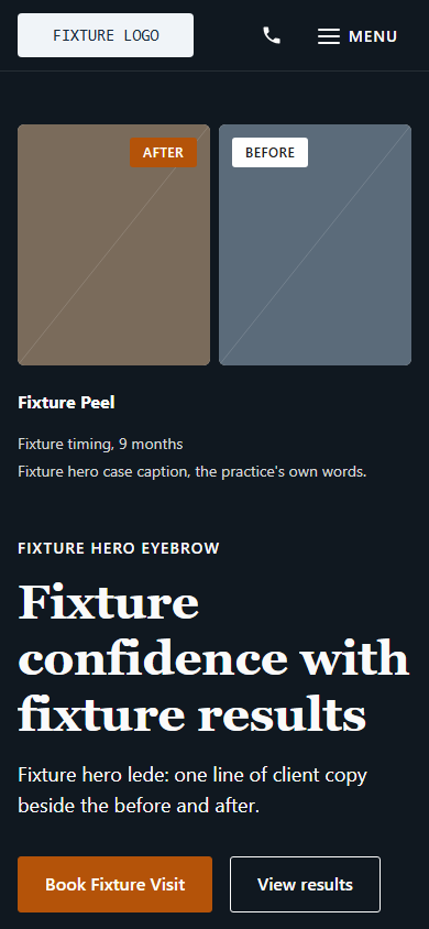
Concept A on a tall phone: the before and after pair at the top, then the eyebrow, headline, lede and buttons
Tall phone · 844
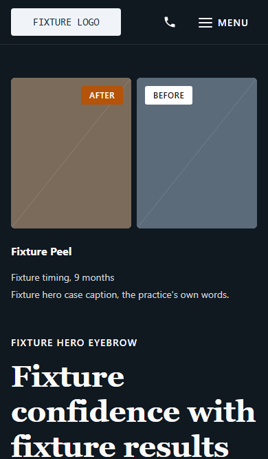
Concept A on a short phone: the pair, the caption and the eyebrow and headline; the buttons are below the fold
Short phone · 667
Concept A, the full homepage
Whole page
(scroll inside)
Concept A · the fallback for a long headline

Proof first Pair → eyebrow → h1 → lede → buttons → facts

  1. Before and after pair, both whole, tagged
  2. Case title, timing, caption
  3. Eyebrow and h1
  4. Lede
  5. Book button and View results
  6. Four facts

What it buys. The proof is the first thing on the screen, before a word is read: Concept 3's argument carried onto the phone, and the closest to how ihair.com's own mobile hero opens. The pair is above the fold on every phone, whatever the length of the h1.

What it costs. The h1 starts 60% of the way down a tall phone and is clipped by the fold on a short one. The Book button is inside the first screen on a tall phone but a scroll below it on the SE. The page opens on a picture rather than on who you are.
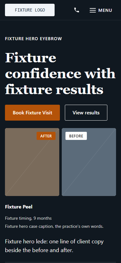
Concept B on a tall phone: the eyebrow and headline at the top, the two buttons right under them, then the before and after pair, then the lede
Tall phone · 844
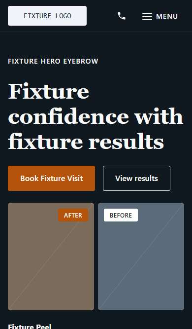
Concept B on a short phone: eyebrow, headline, buttons and the whole pair just inside the fold
Short phone · 667
Concept B, the full homepage
Whole page
(scroll inside)
Concept B · Chosen by Steve, 2026-11-03 · shipping on PR 98

Words first, proof under the buttons Eyebrow → h1 → buttons → pair → lede → facts

  1. Eyebrow and h1
  2. Book button and View results, right under the headline
  3. Before and after pair, both whole, tagged
  4. Case title, timing, caption
  5. Lede
  6. Four facts

What it buys. The page opens the way the desktop does: who you are, what you promise, how to book, and the proof right under the thumb. With a three-line h1 the whole pair is inside the first screen on both phones: it ends at 629px, 38px above the SE's fold. Headline and Book button are as high as they can be.

What it costs. It depends on the headline. Every extra line of h1 (about 50px) or a two-line eyebrow pushes the pair down; a four-line h1 cuts the pair on the SE. The caption and lede fall below the fold on the short phone. So B needs the practice's h1 held to three lines at 390px, which is a thing Gate 2 has to check, not a thing the template guarantees.

Side by side, measured on the build

At 390 wideA · Proof firstB · Words first
Pair whole above the fold, tall phone (844)Yes, 113–332pxYes, 411–629px
Pair whole above the fold, short phone (667)YesYes, with 38px to spare
h1 inside the first screenTall yes (521–674px); short clippedYes on both (159–312px)
Book button inside the first screenTall yes (778–829px); short noYes on both (336–387px)
Holds if the h1 runs to four linesYes, nothing moves above the pairPair cut on the short phone
Closest to ihair.com's own mobile heroTheir hero opens on the pictureCloser to their desktop order
Template costEleven lines of CSS to flip backOn PR 98 now

Recommendation

Steve chose B on 2026-11-03: words first, the pair right under the buttons. It ships on PR 98. A stays the fallback if a headline cannot be held to three lines.

  1. B meets the rule on the build as it stands. On both phone heights the whole before and after is inside the first screen, and the headline and the Book button are higher than A can ever put them. That is the better first screen when it holds.
  2. The condition is real but narrow. B's only weakness is a long headline. iHair's h1 is the same length as the fixture's, and Gate 2 reviews the homepage at 390px anyway, so the check costs nothing. If a practice later wants a long h1 on this variant, the hero flips to A with one setting rather than a redesign.
  3. A stays the safe default for partner landing pages. Where the headline is not under our control, A's picture-first order is the one that cannot fail the rule.

Either order is a few lines of CSS in the hero band, so the choice is reversible at Gate 2 once the iHair skin and the real headline are in. Pictures and words here are the fixture's placeholders. Positions in the table are from the built page at 390px wide.
